Re: WP 34S - Pics of blue slant overlay on real calculator
Message #10 Posted by Bob Cortopassi on 16 Feb 2012, 12:00 p.m.,
in response to message #3 by Morten Nygaard Ĺsnes
Morten,
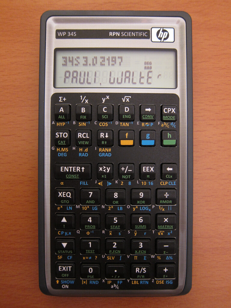
Overall I would say it looks better in real life, but the blue is definitely more subdued than the yellow/green. That was one of my main motivators behind having the blue front labels. Those (for me) are lesser-used functions than the yellow/green.
I think this is, overall, a much more intuitive layout. Normal calculating functions are the most obvious and at the top of the keys like every other calculator we use.
Alpha labels are muted and to the lower right, as on almost every other HP calculator.
The menus and mode settings are generally less used, and are a subdued blue on the key fronts.
My opinion is obviously biased. :-)
Regards,
Bob
|