The Museum of HP Calculators

HP Forum Archive 17

[ Return to Index | Top of Index ]

My minor 35s modifications
Message #1 Posted by Hugh Evans on 31 May 2007, 1:16 p.m.

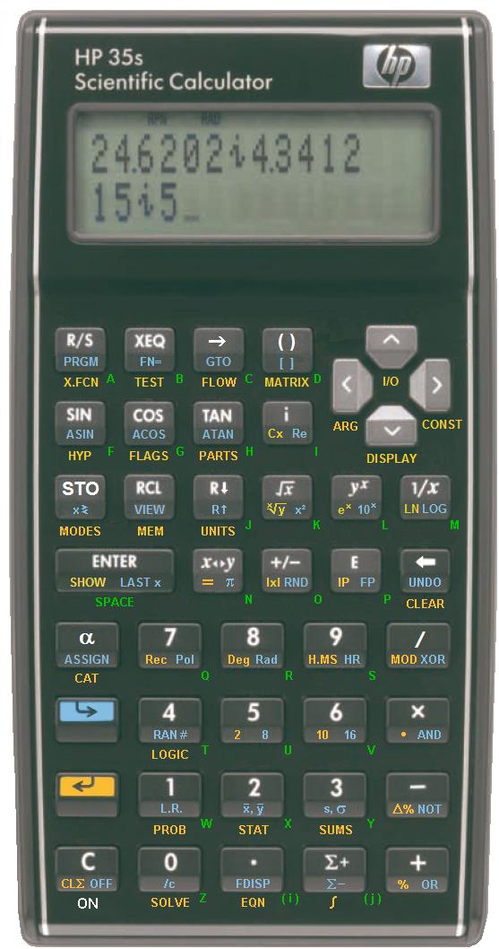
Considering there is probably time left to make a few changes before mass production, I figure it's worth a shot to put together a slight change in the keyboard layout to make the stack manipulation keys more accessible. In addition, I applied the colors that I selected for OpenRPN. They are the end result of my research on human optics and included sources such as NASA's guidelines for man-machine-interfaces.

If anyone from HP wants any information from me on these colors I will be more than happy to furnish them with everything they could want to know. I can also suggest a better typeset if desired.

Feedback from the community is welcome.

[Edit: Far left- My first set of modifications, Middle- My modifications plus suggested dark cursor keys, Right- Unedited HP image -HDE]

Edited: 31 May 2007, 4:00 p.m. after one or more responses were posted

      
Re: My minor 35s modifications
Message #2 Posted by Egan Ford on 31 May 2007, 1:55 p.m.,
in response to message #1 by Hugh Evans

Get rid of kg/lb, mile/kg, etc...

Add Matrix ops, Floor, Ceiling, Mod, Round, String manipulation, P<>R. Restore STO.

            
Re: My minor 35s modifications
Message #3 Posted by Hugh Evans on 31 May 2007, 2:14 p.m.,
in response to message #2 by Egan Ford

My intention is to make modifications that are minor enough for HP to implement without too much effort prior to mass production.

Save the other ideas for the modification community.

                  
Re: My minor 35s modifications
Message #4 Posted by Jürgen (CH) on 31 May 2007, 3:23 p.m.,
in response to message #3 by Hugh Evans

For those using SI units (some of them use also this strange umlaut characters) these conversion functions are not very useful. I would put them into a menu and use the keys for other (more generally useful) stuff. Personally, I also dislike the light grey of the cursor keys; the light color is too attracting and disturbs the otherwise very nice design. Anyway, it's by far the most interesting calculator HP presented in the last few years. I definitely would buy one.

Cheers, Jürgen

                        
Oops, wrong thread
Message #5 Posted by Jürgen (CH) on 31 May 2007, 3:29 p.m.,
in response to message #4 by Jürgen (CH)

Ignore my previous message, it went into the wrong thread. Sorry

                  
Re: My minor 35s modifications
Message #6 Posted by BruceH on 31 May 2007, 7:28 p.m.,
in response to message #3 by Hugh Evans

Quote:
My intention is to make modifications that are minor enough for HP to implement without too much effort prior to mass production.
How about changing the shift keys to have arrows that point up and down rather than left and right, as someone pointed out before?
            
Re: My 35s modifications
Message #7 Posted by Walter B on 4 June 2007, 6:07 p.m.,
in response to message #2 by Egan Ford

OK, let's try:

What is modified?

  • there is an ALPHA key
  • STO is unshifted
  • we would have the opportunity to ASSIGN CATalog functions to keys
  • IP and FP are visible
  • a MATRIX menu is provided
  • an I/O menu is provided
  • LBL, RTN, ISG, and DSE are collected in a menu FLOW
  • an unshifted -> is introduced to allow double use of mode keys also for conversions (e.g. blue-shift 6 sets hexadecimal mode, while -> blue-shift 6 converts to hex display); this makes the menu BASE obsolete
  • the 4 basic logic operations are on the keyboard
  • unit conversions are collected in a UNITS menu
  • there is a MODulo operation on the keyboard
  • nPr, nCr, x!, and SEED are collected in PROB
  • x?y and x?0 are merged in TEST
  • INPUT and PSE are collected in X.FCN, where more special operations may be hosted
  • I cleaned the key plate; all yellow print there is for menus now (not so sure for ARG); the blue print on keys 1, 2, 3 is for menus, too – everything else are just functions
  • etc.

You are invited to criticize 8)

Best regards, Walter

Edited to include the HP35s's published keyboard for direct comparison (thanks, Hugh). Edited to correct the picture address.

Edited: 10 June 2007, 1:43 a.m. after one or more responses were posted

                  
Re: My 35s modifications
Message #8 Posted by Wayne Brown on 4 June 2007, 7:59 p.m.,
in response to message #7 by Walter B

Quote:
You are invited to criticize 8)

OK: It still has the awful cursor keys. :-)

                        
Re: My 35s modifications
Message #9 Posted by Walter B on 5 June 2007, 12:36 a.m.,
in response to message #8 by Wayne Brown

Wayne, you are perfectly right :-)

Please consider: if we change this, we will need at least a new punching tool for the key plate and a new PCB design. By keeping this feature we save this money for whatever good. Please decide where you want to spend the bucks - and remember you can do so only once d:-)

                        
Re: My 35s modifications
Message #10 Posted by Jeff O. on 5 June 2007, 8:08 a.m.,
in response to message #8 by Wayne Brown

Quote:
OK: It still has the awful cursor keys.
Wayne,
Would you buy the 35s if it had this arrangement for the cursor keys?:


Or would it take this one?:

Edited: 5 June 2007, 8:31 a.m.

                              
Re: My 35s modifications
Message #11 Posted by Gene on 5 June 2007, 9:26 a.m.,
in response to message #10 by Jeff O.

Why cater to him at all? It still isn't shaped like a brick with edges sharp enough to peel an orange.

Partial :-) there, but not much of one.

                                    
Re: My 35s modifications
Message #12 Posted by Jeff O. on 5 June 2007, 12:59 p.m.,
in response to message #11 by Gene

Gene,
I wasn't necessary trying to or suggesting that hp cater to Wayne. I decided to create the images with the revised keyboards just to see how they might look. Having done so, I figured I'd see if that might be enough to please Wayne, or if another deal-breaker would come up. It will be just fine with me if the 35s is produced with the cursor keys exactly the way they were presented originally.

                              
Re: My 35s modifications
Message #13 Posted by Donald on 5 June 2007, 11:01 a.m.,
in response to message #10 by Jeff O.

looks superb - much better than HP's attempt.

The first is probably better - fewer accidental hits of the MODE key.

The 'i' complex key is moving rather far away from the other numeric keys - how about swapping the, redundant in RPN, '( )' with 'i' . Even in algebraic the <> would be used in conjunction with ( ).

                                    
Re: My 35s modifications
Message #14 Posted by John on 5 June 2007, 11:56 a.m.,
in response to message #13 by Donald

You shouldn't call the parentheses keys redundant. They are used heavily in the equation mode on the 33s.

And, if you don't make the calculator friendly to use in algebraic mode, sales will be hurt. Sure, none of us may use the 33s in algebraic mode, but you can't make algebraic extra difficult or sales won't be good.

                                    
Re: My 35s modifications
Message #15 Posted by Jeff O. on 5 June 2007, 12:47 p.m.,
in response to message #13 by Donald

Quote:
The first is probably better - fewer accidental hits of the MODE key.
The 'i' complex key is moving rather far away from the other numeric keys - how about....
Thanks for the compliment on the looks. I mostly did it just to see what it might look like. I restrained myself from trying to optimize the keyboard.
                              
Re: My 35s modifications
Message #16 Posted by Wayne Brown on 5 June 2007, 1:34 p.m.,
in response to message #10 by Jeff O.

I'd prefer the second arrangement, but the first would be OK too. In fact, I wouldn't mind an arrangement like < > v ^ as I use the h j k l keys on my computer keyboards all the time in exactly that way for cursor movement. The main point is to avoid anything reminiscent of keys on a cell phone, game, TV remote, or other non-technical "consumer" device.

                        
Re: My 35s modifications
Message #17 Posted by DaveJ on 5 June 2007, 3:25 a.m.,
in response to message #8 by Wayne Brown

Quote:

OK: It still has the awful cursor keys. :-)


And the redundant backspace key! There is already a left arrow key that can do the job just admirably.

Dave.

                              
Re: My 35s modifications
Message #18 Posted by Walter B on 5 June 2007, 12:32 p.m.,
in response to message #17 by DaveJ

Quote:
And the redundant backspace key! There is already a left arrow key that can do the job just admirably.
The cursor keys are for moving, the backspace is for clearing. Look at your keyboard, please, and think.
      
Re: My minor 35s modifications
Message #19 Posted by John on 31 May 2007, 2:39 p.m.,
in response to message #1 by Hugh Evans

Where did that picture come from? Much more detailed that any previous picture.

            
Re: My minor 35s modifications
Message #20 Posted by Hugh Evans on 31 May 2007, 2:53 p.m.,
in response to message #19 by John

It came from HP's PDF. My guess is that it looks better to your eyes now that the labels have much better contrast... Which is exactly the point I'm trying to get across to HP.

Edited: 31 May 2007, 2:56 p.m.

                  
Re: My minor 35s modifications
Message #21 Posted by John on 31 May 2007, 3:18 p.m.,
in response to message #20 by Hugh Evans

No, that wasn't my point at all. The green gets lost next to the blue, so the color looks worse.

The resolution looked higher than I have extracted from the PDF, so I wondered where you got it. Looking at the original PDF now and it is clearly different.

                        
Re: My minor 35s modifications
Message #22 Posted by Hugh Evans on 31 May 2007, 3:27 p.m.,
in response to message #21 by John

Well, the PDF is my source. I updated my original post for a side-by-side comparison.

The red alpha labels are nearly impossible to see, and the green color I selected has a good degree of difference from the nearby blue (90° difference in lab coordinates). The only other logical alternative would be to make the alpha labels white.

-Hugh

Edited: 31 May 2007, 3:34 p.m.

                              
Re: My minor 35s modifications
Message #23 Posted by John on 31 May 2007, 5:17 p.m.,
in response to message #22 by Hugh Evans

The red are perfectly visible.

How about you start a new thread asking for a vote?

Red vs. Green?

                                    
Re: My minor 35s modifications
Message #24 Posted by Hugh Evans on 31 May 2007, 5:30 p.m.,
in response to message #23 by John

Maybe to your eyes. The red color HP has chosen has a much lower luminance score, 20-30 points lower than my green. That just means *much* better contrast. As far as I can tell HP did not put any thought into their color selection aside from approximating colors from the voyager series (which weren't perfect either).

Red is a lousy color to work with against a dark background anyways. I'm sticking with green, you're welcome to your opinion... But my solution is correct.

                                          
Re: My minor 35s modifications
Message #25 Posted by Dennis Trafananko on 31 May 2007, 11:17 p.m.,
in response to message #24 by Hugh Evans

Another color possibility for the Alpha labels is a magenta shade (diametrically opposed to the green), with a brightness (value in HSV) to be visible against the dark background. The green appears to clash with the other colors in the pictures, it just looks out of place.

                                                
Re: My minor 35s modifications
Message #26 Posted by Hugh Evans on 1 June 2007, 11:31 a.m.,
in response to message #25 by Dennis Trafananko

Yeah, I spec'd a color like but would prefer not to use it. Here's a copy of the optimal color palette I defined. HP was very close to perfect on early pioneer models such as the 48sx, they clearly did their homework. The green and purple colors I defined are what the should have used on the later 48g.

                                          
Re: My minor 35s modifications
Message #27 Posted by Bram on 1 June 2007, 6:51 a.m.,
in response to message #24 by Hugh Evans

Quote:
Red is a lousy color to work with ...

I agree with this.
That's why my HP-28S is practically useless to me. Too difficult to read. Even on not so dark background.

      
Re: My minor 35s modifications
Message #28 Posted by Steve Borowsky on 31 May 2007, 4:07 p.m.,
in response to message #1 by Hugh Evans

Wow, that's much improved. Good job.

            
Re: My minor 35s modifications
Message #29 Posted by GE on 1 June 2007, 4:46 a.m.,
in response to message #28 by Steve Borowsky

Green looks much better than red IMHO. I hope it makes it to the production model, but it is very probably too late.

      
Re: My minor 35s modifications
Message #30 Posted by Bob on 31 May 2007, 4:44 p.m.,
in response to message #1 by Hugh Evans

I would love to see some basic TVM/financial functions since so much of engineering, project management, and science require some level of financial justification or evaluation on top of the technical work.

The financial solver on the 48GX, or similar, would work fine. I don't even care if it is buried in a menu somewhere.

            
Re: My minor 35s modifications
Message #31 Posted by Chuck on 31 May 2007, 5:00 p.m.,
in response to message #30 by Bob

One equation in the solver can calculate all the needed TVM's, including annuities, loan paymens, future values, present values, etc. I have a version on most of my programmable calcs that don't have a built in TVM solver. But a built in TVM shouldn't be that hard to include.

      
Re: My minor 35s modifications
Message #32 Posted by Chuck on 31 May 2007, 4:55 p.m.,
in response to message #1 by Hugh Evans

My eyes don't spot an "ALPHA" key. I wonder how one would store a value into a lettered register (unless it automatically switches mode, a feature I don't like.)

            
Re: My minor 35s modifications
Message #33 Posted by Hugh Evans on 31 May 2007, 5:08 p.m.,
in response to message #32 by Chuck

I'm confused about that exact problem myself.

                  
Re: My minor 35s modifications
Message #34 Posted by John on 31 May 2007, 5:28 p.m.,
in response to message #33 by Hugh Evans

If this is like the HP33s, then you press STO and the key a letter is on.

Hugh, have you even owned an HP32s, HP32sII, or an HP33s? That's the series of machines since 1988.

That's how HP has done this in that time period.

Your yellow on the images is different, so your not comparing apples to apples. If the yellow contrast/color is different, then you can't know what reality would be.

                        
Re: My minor 35s modifications
Message #35 Posted by Hugh Evans on 31 May 2007, 5:37 p.m.,
in response to message #34 by John

I know my colors are different. They are also better tuned to the human eye. I'm not comparing apples to apples, I'm comparing my solution to HP's. Sure, my renderings are not under photographic conditions but tweaking the color scheme for natural light isn't much of a challenge.

                        
Re: My minor 35s modifications
Message #36 Posted by Norris on 31 May 2007, 5:42 p.m.,
in response to message #34 by John

On the 33S, pressing STO, RCL, or LBL automatically toggles alpha mode. This mode only lasts for a single keystroke, because the variables and labels on the 33S are restricted to a single letter.

If you are entering equations, such as "A = B + C", then you have to hit STO or RCL before entering each letter. When you enter equations, the STO and RCL commands don't do anything except toggle the alpha mode. You can store brief text strings as dummy "equations", but you have to press STO or RCL before every letter; there is no "alpha lock" mode.

I believe the 32S and 32SII are similar, and the 35S probably is too. It sounds like the 35S may recognize two-letter variables and labels, but even in this case, there might not be a need for a dedicated alpha key.

      
Re: My minor 35s modifications
Message #37 Posted by John on 31 May 2007, 5:25 p.m.,
in response to message #1 by Hugh Evans

Of course, this is hardly fair, given the green you used wasn't actually photographed under real lighting.

      
HP35s: Keyboard errors
Message #38 Posted by Patrice on 1 June 2007, 4:51 p.m.,
in response to message #1 by Hugh Evans

Hi all,

The pictures on top are showing miswritings.

The problem is with metric units writing, they don't follow the rules.

kilogram is Kg, kg is wrong ! kilometer is Km, KM is wrong ! centimeter is cm, which is right !

As I already said, I don't like spending so much place on keyboard for conversion functions that I will almost never use, and not having others like FP, IP and modulus.

If they let them on keyboard, they sould at least write them right.

Patrice from France

            
Re: HP35s: Keyboard errors
Message #39 Posted by Maximilian Hohmann on 1 June 2007, 5:15 p.m.,
in response to message #38 by Patrice

Hello!

Quote:
kilogram is Kg, kg is wrong ! kilometer is Km, KM is wrong ! centimeter is cm, which is right !

Not quite: In the international system of units (SI) (*), lowercase "k" stands for kilo or thousands and uppercase "K" for Kelvin.
So "kg" is indeed the correct way to abbreviate kilograms, but kilometers are neither "Km" nor "KM", but "km" instead.

And like you, I also think that these conversions are quite useless on a general-purpose scientific calculator. I would rather like user-defineable conversions (labelled maybe as "C1" ... "C5") that can be used for whatever the individual user needs to convert (from currencies to nanoAngstroems)

Greetings, Max

(*) see here: http://www.bipm.org/en/si/
                  
Re: HP35s: Keyboard errors
Message #40 Posted by cfh on 1 June 2007, 5:54 p.m.,
in response to message #39 by Maximilian Hohmann

It is spelled Ångström :-) No umlauts, no pluralis s...

cheers cfh

                        
Re: HP35s: Keyboard errors
Message #41 Posted by Walter B on 2 June 2007, 1:09 a.m.,
in response to message #40 by cfh

Reminds me of my all time favourite unit: Potatoes per Ångström ...

                              
Re: HP35s: Keyboard errors
Message #42 Posted by Dominic Richens on 5 June 2007, 11:23 a.m.,
in response to message #41 by Walter B

Quote:
Reminds me of my all time favourite unit: Potatoes per Ångström ...

Isn't that a constant?

My favourite unit is furlongs per fortnight (0.000166309524 m/s according to Google)

                                    
Re: HP35s: Keyboard errors
Message #43 Posted by Walter B on 5 June 2007, 1:04 p.m.,
in response to message #42 by Dominic Richens

Quote:
> Reminds me of my all time favourite unit: Potatoes per Ångström ...

Isn't that a constant?


No, it's a unit for an area. A standard potatoe represents a volume of 187.0815 cm³ = 187.0815*10^-6 m³, an Ångström equals 10^-10 m, so a P/Å equals 187.0815*10^4 m² = 1.870815*10^6 m² = 1.870815 km². Enjoy! d;-)
                                          
Re: HP35s: Keyboard errors
Message #44 Posted by Dave Shaffer on 5 June 2007, 11:22 p.m.,
in response to message #43 by Walter B

This reminds me of my favorite (?) unit: inverse acres

Useful for the mileage that you get with your car: miles/gallon, which is length/length^3, or 1/length^2 which has the same dimensionality as inverse acres. (Determining the actual conversion factor is "left to the student" and his/her favorite HP calculator.)


[ Return to Index | Top of Index ]

Go back to the main exhibit hall