The Museum of HP Calculators

HP Forum Archive 21

[ Return to Index | Top of Index ]

Another poll until next Wednesday, 12.12.12, 12:12 UTC
Message #1 Posted by Walter B on 5 Dec 2012, 7:53 a.m.

Hi all,

There may be different solutions for differentiating menus from functions on the keyboard. On the WP 34S, we printed menu labels underlined and got very positive response for that decision. On the HP-42S, menu labels were printed on a slightly different background color. There was a recent proposal to print menu labels inverted - i.e. black on light blue if I got this right. This doesn't look good, however, IMHO. Taking into account that the general color of the keyplate will be a brownisch black (like 25, 25, 13), the alternatives are:

Shall menu labels be printed on the keyboard either underlined or on a lighter background?

Please participate!

d:-)

      
Re: Another poll until next Wednesday, 12.12.12, 12:12 UTC
Message #2 Posted by Silvio A. Bensi on 5 Dec 2012, 8:53 a.m.,
in response to message #1 by Walter B

Lighter background.

      
Re: Another poll until next Wednesday, 12.12.12, 12:12 UTC
Message #3 Posted by Bart (UK) on 5 Dec 2012, 10:01 a.m.,
in response to message #1 by Walter B

Lighter background.

Thanks.

      
Poll (12.12.12, 12:12 UTC): Menu Labels: underlined or on lighter bkgd
Message #4 Posted by Raymond Del Tondo on 5 Dec 2012, 10:39 a.m.,
in response to message #1 by Walter B

Lighter background, of course.

I also edited the title, which was missing some important information...

            
Re: Poll (12.12.12, 12:12 UTC): Menu Labels: underlined or on lighter bkgd
Message #5 Posted by Bart (UK) on 5 Dec 2012, 11:23 a.m.,
in response to message #4 by Raymond Del Tondo

Quote:
I also edited the title...
Yes, I think it is a good idea to add the subject of the poll to the title.
      
Re: Another poll until next Wednesday, 12.12.12, 12:12 UTC
Message #6 Posted by Didier Lachieze on 5 Dec 2012, 10:42 a.m.,
in response to message #1 by Walter B

Underlined. Easier for people who may have troubles with color vision.

            
Re: Another poll until next Wednesday, 12.12.12, 12:12 UTC
Message #7 Posted by Massimo Gnerucci (Italy) on 5 Dec 2012, 10:57 a.m.,
in response to message #6 by Didier Lachieze

lighter background

      
Re: Another poll until next Wednesday, 12.12.12, 12:12 UTC
Message #8 Posted by Quan on 5 Dec 2012, 11:38 a.m.,
in response to message #1 by Walter B

lighter background

      
Re: Another poll until next Wednesday, 12.12.12, 12:12 UTC
Message #9 Posted by Hans Holzach on 5 Dec 2012, 11:44 a.m.,
in response to message #1 by Walter B

lighter background.

      
Lighter background
Message #10 Posted by Maximilian Hohmann on 5 Dec 2012, 12:52 p.m.,
in response to message #1 by Walter B

Lighter background

      
Re: Another poll until next Wednesday, 12.12.12, 12:12 UTC
Message #11 Posted by Dale Reed on 5 Dec 2012, 1:13 p.m.,
in response to message #1 by Walter B

Neither. Do what all the operating systems do for menu items that open another dialog: Print the name with an ellipsis after it.

File
    New...
    Open...
    Close
    ----------
    Save
    Save As...

I have, however, seen some apps (Lotus Note 8.5.x, for example) that use a right-pointing triangle instead of an ellipsis. Perhaps, since a calculator's menus appear on a display above the keyboard (usually), the triangle should be pointing upward.

  Cplx^

(That carat is used to represent a filled triangle, which must look different from any symbol used to indicate, for example, raising to a power... but you knew that.)

Discuss.

Dale

            
Re: Another poll until next Wednesday, 12.12.12, 12:12 UTC
Message #12 Posted by Maximilian Hohmann on 5 Dec 2012, 1:33 p.m.,
in response to message #11 by Dale Reed

Hello!

Quote:
I have, however, seen some apps ... that use a right-pointing triangle instead of an ellipsis.

On MacOS (and iOS) which use the ellipsis as described, the right-pointing triangle means that there is a sub-menu to follow.

But yes, I would support the ellipsis concept if only I could vote for it!

max

                  
About alternative menu indicators
Message #13 Posted by Walter B on 5 Dec 2012, 1:47 p.m.,
in response to message #12 by Maximilian Hohmann

I like Dale's suggestion. For space reasons, however, I'd prefer a shorter character than an elipsis. How about character 135 of Wingdings3 trailing all menu labels?

Edited: 5 Dec 2012, 1:47 p.m.

                        
Re: About alternative menu indicators
Message #14 Posted by Mark Hardman on 5 Dec 2012, 2:30 p.m.,
in response to message #13 by Walter B

Any upward pointing Wingding could be confused with exponentiation. A right pointing Wingding looks like a greater than symbol. The true ellipsis symbol only takes up a single character and not three: …

My vote would be for …

Barring that, underline is preferable to the lighter background for my aging eyes.

Mark Hardman

Edited: 5 Dec 2012, 2:32 p.m.

                              
Re: About alternative menu indicators
Message #15 Posted by Jeff O. on 5 Dec 2012, 3:54 p.m.,
in response to message #14 by Mark Hardman

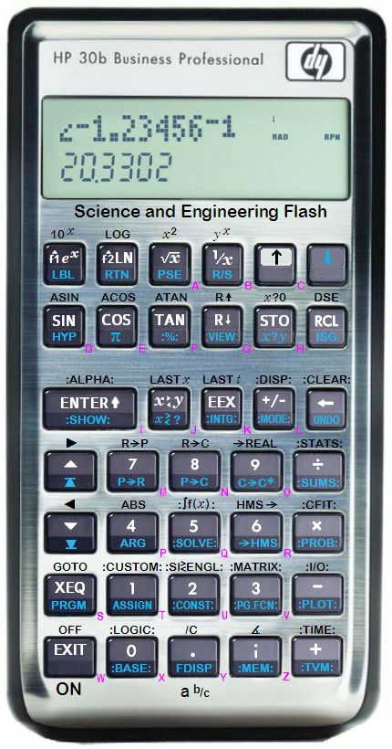
I once proposed enclosing menu labels in colons, as illustrated below in my stillborn concept for a repurposed 30b. I don't recall if there was much reaction to that particular concept. I still like it as an alternative to underlining or printing on a lighter background.

...

                                    
Re: About alternative menu indicators
Message #16 Posted by fhub on 5 Dec 2012, 4:12 p.m.,
in response to message #15 by Jeff O.

Quote:
I once proposed enclosing menu labels in colons, as illustrated below...
When I look at your picture I must say: these colons are almost invisible - at least I have to look 2 or 3 times to recognize them.

I like the way it was done in the WP34s best, i.e. underlined. Of course the label could additionally have a different background color.

But I don't understand the need for such menu label on keys at all!? Since we have now 6 function keys and 6 text field above them (if I understand it correctly), I thought the purpose of those 6 keys would exactly be to activate and display all those menus (with different functions in it)? So the normal keys could be used for other heavily used functions.

Franz

                                          
About the need for menu labels on the keyboard
Message #17 Posted by Walter B on 6 Dec 2012, 2:40 a.m.,
in response to message #16 by fhub

Quote:
But I don't understand the need for such menu label on keys at all!? Since we have now 6 function keys and 6 text field above them (if I understand it correctly), I thought the purpose of those 6 keys would exactly be to activate and display all those menus (with different functions in it)? So the normal keys could be used for other heavily used functions.
Almost ;-) You'll be free to assign them this way. We plan to have a fully user-assignable keyboard, however, so menu labels may show up at any location (read here, especially the paragraph about menus). I beg your pardon that text is a bit long but I'm confident you'll make it.

d:-)

      
Re: Another poll until next Wednesday, 12.12.12, 12:12 UTC
Message #18 Posted by Mark Storkamp on 5 Dec 2012, 1:14 p.m.,
in response to message #1 by Walter B

Underlined on a lighter background?

      
Re: Another poll until next Wednesday, 12.12.12, 12:12 UTC
Message #19 Posted by Dave Boyd on 5 Dec 2012, 9:14 p.m.,
in response to message #1 by Walter B

Underlined.

      
Re: Another poll until next Wednesday, 12.12.12, 12:12 UTC
Message #20 Posted by Mike Hein on 6 Dec 2012, 12:13 a.m.,
in response to message #1 by Walter B

Underlined.

      
Re: Another poll until next Wednesday, 12.12.12, 12:12 UTC
Message #21 Posted by Morten Nygaard Ĺsnes on 6 Dec 2012, 12:52 a.m.,
in response to message #1 by Walter B

underlined

      
Re: Another poll until next Wednesday, 12.12.12, 12:12 UTC
Message #22 Posted by Paul Dale on 6 Dec 2012, 12:56 a.m.,
in response to message #1 by Walter B

Underlined.

- Pauli

      
Re: Another poll until next Wednesday, 12.12.12, 12:12 UTC
Message #23 Posted by Eddie W. Shore on 6 Dec 2012, 1:21 a.m.,
in response to message #1 by Walter B

Quote:
Hi all,

There may be different solutions for differentiating menus from functions on the keyboard. On the WP 34S, we printed menu labels underlined and got very positive response for that decision. On the HP-42S, menu labels were printed on a slightly different background color. There was a recent proposal to print menu labels inverted - i.e. black on light blue if I got this right. This doesn't look good, however, IMHO. Taking into account that the general color of the keyplate will be a brownisch black (like 25, 25, 13), the alternatives are:

Shall menu labels be printed on the keyboard either underlined or on a lighter background?

Please participate!

d:-)


Lighter Background - looks neater.

      
Re: Another poll until next Wednesday, 12.12.12, 12:12 UTC
Message #24 Posted by Angel Martin on 6 Dec 2012, 1:29 a.m.,
in response to message #1 by Walter B

Lighter background

      
Menu labels printed either underlined or on a lighter background?
Message #25 Posted by Walter B on 6 Dec 2012, 2:27 a.m.,
in response to message #1 by Walter B

Personally, I prefer the underlined result. My reasons:

  • lower space costs
  • cleaner (lighter background would add another color)
  • easier to recognize under low lighting conditions.
But that's just one vote and YMMV.

d:-)

            
Re: Menu labels printed either underlined or on a lighter background?
Message #26 Posted by Pete Wilson on 6 Dec 2012, 7:49 p.m.,
in response to message #25 by Walter B

Actually underlining has higher space costs than inverse or lighter background...

Though I think the 42S actually had darker backgrounds for the menu keys :)

                  
Re: Menu labels printed either underlined or on a lighter background?
Message #27 Posted by Walter B on 6 Dec 2012, 8:27 p.m.,
in response to message #26 by Pete Wilson

Quote:
I think the 42S actually had darker backgrounds for the menu keys :)
It has not - at least my two haven't.

d:-)

      
Re: Another poll until next Wednesday, 12.12.12, 12:12 UTC
Message #28 Posted by David Griffith on 6 Dec 2012, 3:19 a.m.,
in response to message #1 by Walter B

Underlined. Easier to read under non-optimal light conditions.

      
Re: Another poll until next Wednesday, 12.12.12, 12:12 UTC
Message #29 Posted by Jeff O. on 6 Dec 2012, 8:02 a.m.,
in response to message #1 by Walter B

Underlined

      
Re: Another poll until next Wednesday, 12.12.12, 12:12 UTC
Message #30 Posted by David Hayden on 6 Dec 2012, 1:01 p.m.,
in response to message #1 by Walter B

Underlined.

      
Re: Another poll until next Wednesday, 12.12.12, 12:12 UTC
Message #31 Posted by aurelio on 6 Dec 2012, 3:25 p.m.,
in response to message #1 by Walter B

Underlined, thank-you

      
Re: Another poll until next Wednesday, 12.12.12, 12:12 UTC
Message #32 Posted by Pete Wilson on 6 Dec 2012, 7:50 p.m.,
in response to message #1 by Walter B

If I can't have inverse, lighter background :)

      
Re: Another poll until next Wednesday, 12.12.12, 12:12 UTC
Message #33 Posted by Calum Tait on 7 Dec 2012, 8:44 p.m.,
in response to message #1 by Walter B

I like the ellipsis or caret symbol idea - easy to read and easier on the eye than either alternate background colour or underlined text.

      
Preliminary results so far
Message #34 Posted by Walter B on 10 Dec 2012, 6:00 a.m.,
in response to message #1 by Walter B

Here are the counts up to now:

  • 12 votes for underlined menu labels (Didier, Mark H., fhub, Dave, Mike, Morten, Pauli, Walter, David G., Jeff, David H., aurelio)
  • 10 votes for printing menu labels on a lighter background (Silvio, Bart, Raimund, Massimo, Quan, Hans, Maximilian, Eddie, Ángel, Pete)
Counting this poll was easier than the previous one - there are less emotions included.

The last vote so far was dropped three days ago. Thus the next poll will probably run shorter.

d:-)

      
Re: Another poll until next Wednesday, 12.12.12, 12:12 UTC
Message #35 Posted by Cristian Arezzini on 10 Dec 2012, 9:21 a.m.,
in response to message #1 by Walter B

I almost missed this poll too... It's not a strong preference for me, but I'd say lighter background. I think it's less cluttered...

Cristian

      
Results of the menu label poll
Message #36 Posted by Walter B on 12 Dec 2012, 7:38 a.m.,
in response to message #1 by Walter B

Thanks for your votes. After all, there are:

  • 12 votes for underlined menu labels (Didier, Mark H., fhub, Dave, Mike, Morten, Pauli, Walter, David G., Jeff, David H., aurelio)
  • 11 votes for printing menu labels on a lighter background (Silvio, Bart, Raimund, Massimo, Quan, Hans, Maximilian, Eddie, Ángel, Pete, Cristian)
Tight race. But the winner is ... underlined!

d:-)


[ Return to Index | Top of Index ]

Go back to the main exhibit hall