Re: WP 34S overlay feedback
Message #34 Posted by JustinM on 14 July 2011, 11:59 p.m.,
in response to message #1 by Eric Rechlin
Hi all. I'm new on the forum but have been reading for about a month. I came looking for info on the re-released HP-15C and stuck around after learning about the WP-34s project. After getting a cable from Gene a couple of weeks ago I've now got a flashed 30b. I flashed it again with the 1196 build last weekend. I missed getting one of Eric's first overlays so I can't comment on the initial run. I would like to comment on some of the topics discussed here and earlier about the overlay.
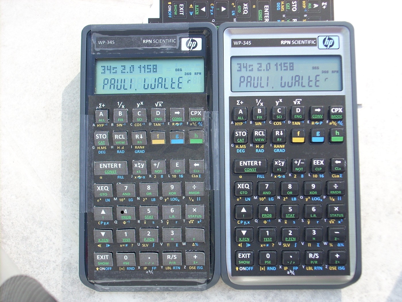
I like the idea of an h-shifted OFF button. Walter's diagram in message #29 is exactly what I had in mind. The ON label looks good on a lower row of text like the 'a b/c' label. I realize that swapping the g and h functions of the EXIT key would require all the original overlays to be replaced, so that should be a consideration.
I prefer the colored shift keys to Walter's preference for white text. The shift keys are some of the most important keys on the keyboard and should have an easy way to visually differentiate them from the other keys. I would even suggest making the entire key cover gold, blue, or green and put the f, g, and h in black font. That would be consistent with the 34C and 67 (except for the green vs. black h-shift key, of course) and the f and g keys of the Voyagers. I would also prefer a 'g' that's like the Arial 'g' instead of the Calibri. The Arial 'g' is more consistent with historical HPs. I realize that the rest of the overlay uses Calibri and changing fonts for one key may not look right though.
On the black ink issue, I have a few suggestions that may or may not work. Eric, have you considered or tested black or transparent vinyl as a base layer? I don't know if the colors will print properly on black vinyl, but that might give the black areas a more durable finish without requiring any overcoat or spray.
With the transparent vinyl, I was picturing placing a black field above each key to print the f and g-shifted functions. The alpha characters and the functions above the A, B, C, and D keys would have to be reworked. My thought with using transparent vinyl is to let the natural black or silver of the 20b or 30b show through. The key hole sizing wouldn't be as critical and could be larger to avoid the sticky key problem. If the overlay's key holes let a bit of a "ring" of the underlying keyboard show through, it wouldn't look bad on the 30b. Putting a black field of ink above each key would cover up "Black S" also. It would cut down on the ink requirement for each printed overlay too.
Finally, on the topic of keys, I'd prefer an EEX exponent key, I like the obelus division key, and I'd like an Enter key without the up arrow on it. In general, I'd like the keyboard to approximate some of the classic styling cues of HP calculators - colored shift keys, EEX, Enter, and an obelus division key. I don't care for the CHS as +/- makes more sense to me.
Thanks to all who have made this project possible. It's been fun to tinker with so far. I haven't been able to put it into more use without an overlay yet, so I'm looking forward to another print run.
| 


