The Museum of HP Calculators

HP Forum Archive 20

[ Return to Index | Top of Index ]

34s Vinyl Overlay Second Attempt
Message #1 Posted by Eric Rechlin on 24 May 2011, 2:50 a.m.

Hi everyone,

I have now made a second attempt with the vinyl overlay for the 34s. I've incorporated a lot of the feedback and made a bunch of changes. I'm still learning and will make some more minor changes still, but I think it's getting very close.

This time I made the button labels a single sticker rather than two, and I am going to see how durable it is. I have also updated the artwork to use the latest labels.

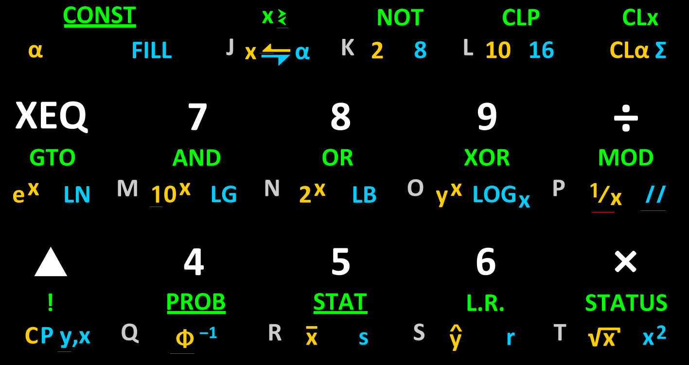
Here is what it looks like:

Here is a closeup of the keys:

And you can download the latest artwork here.

Eric

      
Re: 34s Vinyl Overlay Second Attempt
Message #2 Posted by Paul Dale on 24 May 2011, 4:39 a.m.,
in response to message #1 by Eric Rechlin

Very nice. Do you take orders? :-)

- Pauli

            
Re: 34s Vinyl Overlay Second Attempt
Message #3 Posted by Eric Rechlin on 24 May 2011, 9:21 a.m.,
in response to message #2 by Paul Dale

Quote:
Very nice. Do you take orders? :-)

- Pauli


Not until you guys finalize the keyboard layout. :)

Eric

      
Re: 34s Vinyl Overlay Second Attempt
Message #4 Posted by Marcus von Cube, Germany on 24 May 2011, 6:45 a.m.,
in response to message #1 by Eric Rechlin

We've just changed the layout again...

h+STO is now I/O. h+RCL is now a label browser. Pauli, Walter how will it be named?

Eric, do you take orders? ;-)

            
Re: 34s Vinyl Overlay Second Attempt
Message #5 Posted by Paul Dale on 24 May 2011, 6:53 a.m.,
in response to message #4 by Marcus von Cube, Germany

Those new key labels are just proposed at the moment. They quite possibly will relocate and/or rename.

And before everyone gets really excited, I/O doesn't do off device input/output and possibly never will. It is used to read/write to user flash segments. Currently, a second set of read only registers and three more program spaces (again mostly read only). The registers and one of the program spaces are used for backups.

- Pauli

                  
Re: 34s Vinyl Overlay Second Attempt
Message #6 Posted by Marcus von Cube, Germany on 24 May 2011, 7:02 a.m.,
in response to message #5 by Paul Dale

To be more precise, we're using 4 KB or flash for backup and program storage at the moment. 2 KB serve as backup but the program area of the backup can be used like the other program areas for libraries.

More than 2000 steps if you use it all and don't use backup as a copy of RAM. 1500+ of these steps are in flash. And it's all executable.

      
Re: 34s Vinyl Overlay Second Attempt
Message #7 Posted by JayV on 24 May 2011, 9:09 a.m.,
in response to message #1 by Eric Rechlin

Very nice. If the time comes where these are for sale, I'd be interested as well.

      
Re: 34s Vinyl Overlay Second Attempt
Message #8 Posted by Walter B on 24 May 2011, 1:18 p.m.,
in response to message #1 by Eric Rechlin

Looks very nice again. Bright and clear letter set. However, since you know me, you know you won't go without some personal remarks (in random order):

  1. In your artwork, some marks for cutting the keys would be helpful.
  2. The super- and subscripts should have a smaller letter size than the letters on the base.
  3. f- and g-shifted labels of key 3 are bigger than their siblings.
  4. Default primary function of the division key got a wrong symbol.
  5. g-shifted // is too big in comparison.
  6. In the font you chose (which one?), lower case y is quite close to v. IMO an y standing more apart will be better.
  7. The comma in h-shifted decimal mark is hardly differentiable due to its hook being too faint (as before). This may be appropriate if you want to disguise the difference (e.g. for the default primary function of that key, which may be read as a point or a comma depending on the reader). But in the h-shifted label you should point out the difference instead. The comma in g-shifted ^ looks significantly clearer.
  8. I don't like the bottom bar of the digit 1 - it doesn't really match the very decent style of the other digits and letters IMHO.
  9. While you seem to have taken most of your symbols from one single font, some fall out obviously (or the designer didn't take care of coherence): Phi, g, <, >, <>, and <->. A coherent set will make an even better impression.
As always - just my personal 20m€ :-)

Walter

Edited: 24 May 2011, 2:26 p.m.

            
Re: 34s Vinyl Overlay Second Attempt
Message #9 Posted by Eric Rechlin on 25 May 2011, 12:05 p.m.,
in response to message #8 by Walter B

Quote:
In your artwork, some marks for cutting the keys would be helpful.

I will be shipping them pre-cut so this is irrelevant. I pity anyone who would actually want to cut these by hand.

Quote:
The super- and subscripts should have a smaller letter size than the letters on the base.

I debated that. Using bigger superscripts and subscripts makes them more legible. I might shrink them slightly, though.

Quote:
f- and g-shifted labels of key 3 are bigger than their siblings.

That's because you (or someone?) complained about their relative sizes last time. I will see what I can do.

Quote:
Default primary function of the division key got a wrong symbol.

Not wrong, just different. I'm keeping it because I prefer HP's traditional symbol.

Quote:
g-shifted // is too big in comparison.

It's the same size as everything else, but I suppose I could shrink it.

Quote:
In the font you chose (which one?), lower case y is quite close to v. IMO an y standing more apart will be better.

I am using Calibri as the font. I will see what I can do about altering the 'y' in that font.

Quote:
The comma in h-shifted decimal mark is hardly differentiable due to its hook being too faint (as before).

That is the one place where I used a font other than Calibri, in hopes of avoiding complaints about the character shape, but I see that plan backfired. I will switch that to Calibri for consistency.

Quote:
I don't like the bottom bar of the digit 1 - it doesn't really match the very decent style of the other digits and letters IMHO.

I like it as it is, but I can look into altering the character in the font.

Quote:
While you seem to have taken most of your symbols from one single font, some fall out obviously (or the designer didn't take care of coherence): Phi, g, <, >, <>, and <->. A coherent set will make an even better impression.

How should they look to be coherent? Please draw me an example of how you want it to look to be coherent and I will attempt to adopt your suggestion. Everything is from the font Calibri, although I had to manually alter some characters to get them to look right (for example, I made the arrows in x<->a and R<->P by taking the regular arrow from the font and splitting it in two). Also, the square root character was hand drawn by me.

Eric

                  
Re: 34s Vinyl Overlay Second Attempt
Message #10 Posted by Walter B on 25 May 2011, 1:11 p.m.,
in response to message #9 by Eric Rechlin

Quote:
Quote:
f- and g-shifted labels of key 3 are bigger than their siblings.
That's because you (or someone?) complained about their relative sizes last time.
I admit I was the one - but now you made the then smaller bigger instead of making the bigger smaller. Well, the odds were 50/50 ...
Quote:
Quote:
Default primary function of the division key got a wrong symbol.
Not wrong, just different. I'm keeping it because I prefer HP's traditional symbol.
Sorry, it is wrong - in alpha mode, this key will enter a slash, not a colon plus a horizontal bar.
Quote:
Quote:
g-shifted // is too big in comparison.
It's the same size as everything else, but I suppose I could shrink it.
It's significantly higher than the golden slash next to it below the same key.
Quote:
Quote:
While you seem to have taken most of your symbols from one single font, some fall out obviously (or the designer didn't take care of coherence): Phi, g, <, >, <>, and <->. A coherent set will make an even better impression.
How should they look to be coherent? Please draw me an example of how you want it to look to be coherent and I will attempt to adopt your suggestion. Everything is from the font Calibri, although I had to manually alter some characters to get them to look right (for example, I made the arrows in x<->a and R<->P by taking the regular arrow from the font and splitting it in two). Also, the square root character was hand drawn by me.
While the regular characters have rounded corners, the arrows are very pointy. The lines of Phi are too narrow/slim compared with the other letters. And for g look at Arial, for example. I will try to draw some sample bitmaps for you.

Anyway, thanks for listening.

Walter

                        
Re: 34s Vinyl Overlay Second Attempt
Message #11 Posted by Neil Hamilton (Ottawa) on 25 May 2011, 2:10 p.m.,
in response to message #10 by Walter B

For what it is worth, when I first saw the keyboard of the WP34S, I too thought the slash instead of the traditional division symbol looked out of place. My vote would be for the division symbol on the keyboard as opposed to the slash (I am not concerned with what is written in a program step).

For that matter, I am still trying to figure out what "//" means. I presume that it is in either the HP34C or HP42S manual but I have not come across it yet.

On a slightly different topic: I saw a reference to the MOD operation a while back (and cannot find it anymore) where someone expressed surprise that something like "-14 mod 5" would yield -4. If I repeat this on the HP42S (well actually free42, to be honest) I get the expected value of 1, not -4. My current profession has me heavily involved with public key cryptography, which is rife with modular arithmetic (often called "clock arithmetic"). Traditionally, the modular set is composed of (0 <= x < modulus). Negative numbers are always rationalized back into the modular set (ie: positive). If I look at what the function was called on the HP16C, it was "RMD" (for remainder?). Similarly (from memory), on the HP15C it was called RMDR. I think this is how HP managed to "get away with it" since RMDR is not, strictly speaking, a MOD operation.

The benchmark for this site seems to be Wolfram so the following link states this as well: http://mathworld.wolfram.com/ModularArithmetic.html. See 4th paragraph.

Perhaps a flag could be added for MOD to alternate between true modular mode (0 <= x < modulus) and remainder mode (0 <= |x| < modulus). The only difference is that after the division reduction is complete, if the number is negative, you add in the modulus to bring in to the modular set (the rationalization step).

Note that you will see negative numbers in modular settings (eg: see the FIPS-186 elliptical curves "A" parameter of -3) but this representation is fairly uncommon in the modular world.

                              
Re: 34s Vinyl Overlay Second Attempt
Message #12 Posted by Paul Dale on 25 May 2011, 5:44 p.m.,
in response to message #11 by Neil Hamilton (Ottawa)

Quote:
For what it is worth, when I first saw the keyboard of the WP34S, I too thought the slash instead of the traditional division symbol looked out of place. My vote would be for the division symbol on the keyboard as opposed to the slash (I am not concerned with what is written in a program step).

My vote was for a proper division sign too from memory. I don't mind much either way though.

Quote:
For that matter, I am still trying to figure out what "//" means. I presume that it is in either the HP34C or HP42S manual but I have not come across it yet.

You could try the 34s manual for this one :-) Actually, that should be the first point of reference for everything about this device. Many of the operations are not done exactly the same as previous devices.

Quote:
On a slightly different topic: I saw a reference to the MOD operation a while back (and cannot find it anymore) where someone expressed surprise that something like "-14 mod 5" would yield -4.

Our mod operator is the IEEE remainder operator. So in this case, Wolfram doesn't apply. We claim support for IEEE 854 numbers after all. The integer mode double precision remainder operator does something different with the sign but that is to stay compatible with the 16c.

Now, if there is sufficient demand, it would be possible to add a second operator that does what is asked for here.

For cryptographic operations, I'd suggest sticking to integer mode if not unsigned integer mode. Our integers can represent larger integers exactly, cryptography doesn't usually use floats and it often requires the kind of operations we support for integers (okay, not for public key stuff that I remember).

- Pauli

                                    
Re: 34s Vinyl Overlay Second Attempt
Message #13 Posted by Gerson W. Barbosa on 25 May 2011, 6:51 p.m.,
in response to message #12 by Paul Dale

Quote:
Quote:
For that matter, I am still trying to figure out what "//" means. I presume that it is in either the HP34C or HP42S manual but I have not come across it yet.

You could try the 34s manual for this one :-)


I didn't need the manual to figure out what "//" meant because in circuit analysis I used this symbol for "in parallel", as in R1 // R2 = (R1*R2)/(R1+R2). I'm glad it means the same on wp34s and it is available right from the keyboard. Walter's idea, I presume.

 
Examples:

1) What is the equivalent resistance of two resistors in parallel, R1 = 56 ohms and R2 = 39 ohms?

56 ENTER 39 g // --> 22.9894736842

2) What resistor should be connected in parallel to a 91-ohm resistor so that the equivalent resistance is 31 ohms?

91 +/- ENTER 31 g // --> 47.0166666667

Let's not be confused: the two parallel slashes operator can be also used to compute the equivalent capacitance of two capacitors connected in series.

Gerson.

Edited: 25 May 2011, 6:57 p.m.

                                          
Re: 34s Vinyl Overlay Second Attempt
Message #14 Posted by Paul Dale on 25 May 2011, 7:14 p.m.,
in response to message #13 by Gerson W. Barbosa

Quote:
Walter's idea, I presume.

I doubt either of us remember :-)

The desire for the operation came from these forums (Dave Jones rings a bell but I'm probably wrong). It has been on the keyboard forever. It also works in the complex domain :-)

- Pauli

                                                
Re: 34s Vinyl Overlay Second Attempt
Message #15 Posted by Katie Wasserman on 26 May 2011, 12:37 a.m.,
in response to message #14 by Paul Dale

I've seen the symbol || used for resistors in parallel. This might look better on the keyboard than // and I think is a standard in some sense.

For reference, the || symbol is used in Wikipedia and more importantly it's used in the Handbook of Electronics Calculations. This books defines || to mean "in parallel with".

-Katie

Edited: 26 May 2011, 12:38 a.m.

                                                      
Solution: // means "parallel" (surprise ;)
Message #16 Posted by Walter B on 26 May 2011, 2:17 a.m.,
in response to message #15 by Katie Wasserman

Aha, that may be the reason why Eric printed the // so big. Thanks, Katie. The label may be changed easily. Shall I start another poll?

Walter

Edited adding the emoticon - you never know ;)

Edited: 26 May 2011, 2:18 a.m.

                                                      
Re: 34s Vinyl Overlay Second Attempt
Message #17 Posted by Gerson W. Barbosa on 26 May 2011, 2:14 p.m.,
in response to message #15 by Katie Wasserman

Indeed the symbol || is shown when in program mode. // is a notation I had created for my own use, so it was a surprise when I first saw it below the / key and meaning what I imagined it might mean :-) Anyway, given your reference and in order to match the symbol in program mode perhaps it should be changed to ||.

Gerson.

P.S.: Thanks to the wp34s team I won't need this anymore :-)

001- f LBL A
002-   ENTER
003-   Rv
004-   x<>y
005-   *
006-   LSTx
007- g R^
008-   +
009-   /
010- g RTN

                                                            
Re: 34s Vinyl Overlay Second Attempt
Message #18 Posted by Thomas Klemm on 26 May 2011, 3:09 p.m.,
in response to message #17 by Gerson W. Barbosa

You could use the following program as suggested by Sam in his article : EE calculations, some not obvious

Quote:
when calculating from known resistors, enter the lower resistor repeatedly. Key in the top resistor, and (...)

001- f LBL A
002-   +
003-   /
004-   *
005-   -
006- g RTN

I guess I like this solution best because all the elementary arithmetic operations are used exactly once.

Kind regards
Thomas

                                                                  
Re: 34s Vinyl Overlay Second Attempt
Message #19 Posted by Gerson W. Barbosa on 26 May 2011, 3:35 p.m.,
in response to message #18 by Thomas Klemm

Very nice! Sam's article appears to be a treasure trove of interesting information, it's a pity the text is difficult to read. Thanks for digging this out!

Gerson.

                                                                        
Re: 34s Vinyl Overlay Second Attempt
Message #20 Posted by Thomas Klemm on 26 May 2011, 5:26 p.m.,
in response to message #19 by Gerson W. Barbosa

Quote:
it's a pity the text is difficult to read

FTFY: EE calculations, some not obvious (reformatted)

Thomas

Note for Sam:
If you like the new formatting you can click the [Edit Message] button at the bottom of the page and copy the whole text.
Now do the same on your original page and paste the new version. I assume you must login as Sam Levy and not designnut though.

                                    
Re: 34s Vinyl Overlay Second Attempt
Message #21 Posted by Neil Hamilton (Ottawa) on 26 May 2011, 7:10 a.m.,
in response to message #12 by Paul Dale

Hmmm, "IEEE remainder operator". That sounds a lot like REMAINDER to me and not MOD. :-)

I believe my argument is still correct; you have remainder encoded and not a MOD operation. Hence HP's use of the RMDR and RMD on their calculators -- though, interestingly, my 35S actually calculates a MOD even though its mnemonic is "Rmdr" (HP35S: -14 Rmdr 5 => 1).

I guess my quibble is with the name on the key. Personally, I would prefer the "real" MOD operation for the MOD mnemonic but YMMV.

Sorry, I missed the "//" in the WP34S manual. However, I would not have suspected that it meant parallel. As stated by others, the double pipe would have been a more conventional symbol -- but that symbol would itself likely be confused with a some variant of OR (logical or bitwise). It just goes to show that you can't win when trying to condense information into a very few short symbols on a keyboard! Best of luck satisfying everyone! :-)

Great project!!!!

                        
Re: 34s Vinyl Overlay Second Attempt
Message #22 Posted by Eric Rechlin on 25 May 2011, 2:35 p.m.,
in response to message #10 by Walter B

Quote:
Sorry, it is wrong - in alpha mode, this key will enter a slash, not a colon plus a horizontal bar.

I thought it did "P" in alpha mode?

Quote:
While the regular characters have rounded corners, the arrows are very pointy. The lines of Phi are too narrow/slim compared with the other letters. And for g look at Arial, for example. I will try to draw some sample bitmaps for you.

I'm looking forward to seeing those -- I'd be happy to change the arrows if they still can look good. I agree that Phi doesn't look right. I manually tried to improve it already, but you're right, I should make it thicker.

For the letter 'g', you'll have to take that up with Lucas de Groot, as he clearly intended it to look that way. You might recognize his typographical design from Der Spiegel.

Quote:
[The // is] significantly higher than the golden slash next to it below the same key.

Virtually all of the shifted labels are the same 8-point Calibri (except the Sigma which I increased to 10.5 points and the ones I custom-made). The golden slash is part of the 1/x fraction and is a totally separate character -- notice it's not even angled the same. If you prefer I could change the double slashes to use that fractional slash rather than the forward slash character, and then it would match.

Eric

                              
Re: 34s Vinyl Overlay Second Attempt
Message #23 Posted by Walter B on 25 May 2011, 5:46 p.m.,
in response to message #22 by Eric Rechlin

Ok, here are some exemplary changes, wherever you see a faint red line:

It's far from perfection, but you may see the differences. Please apologize the size of this image, I took you file as it was.

Walter

                                    
Re: 34s Vinyl Overlay Second Attempt
Message #24 Posted by Eric Rechlin on 26 May 2011, 12:57 a.m.,
in response to message #23 by Walter B

Thanks so much. No need to apologize; 83 KB isn't big!

I have now uploaded some new artwork for you to see. I think I got most of the changes you suggested.

Eric

Edited: 26 May 2011, 1:07 a.m.

                                          
Re: 34s Vinyl Overlay Second Attempt
Message #25 Posted by Walter B on 26 May 2011, 2:05 a.m.,
in response to message #24 by Eric Rechlin

Eric,

This looks significantly better now. I wonder, however, what's so difficult in making all the golden, blue and green Greek letters the same size, matching the size of the Latin letters? Perhaps that's the reason for your saying "sounds all Greek to me" ? ;-)

Besides that, there's some symmetry balancing work to be done only IMHO.

Walter

                                                
Re: 34s Vinyl Overlay Second Attempt
Message #26 Posted by Eric Rechlin on 26 May 2011, 8:59 a.m.,
in response to message #25 by Walter B

Quote:
I wonder, however, what's so difficult in making all the golden, blue and green Greek letters the same size, matching the size of the Latin letters?

I already told you. I made them all the same size, 8 points. If there are differences in heights, it's because the font designer designed the font that way. You'd have to take it up with him.

Also, I too am in favor of changing the parallel symbol to || instead of //, since it was always taught to me as || in my EE curriculum. And no, I didn't intentionally make it bigger.

Eric

                                                      
Re: 34s Vinyl Overlay Second Attempt
Message #27 Posted by Walter B on 26 May 2011, 10:32 a.m.,
in response to message #26 by Eric Rechlin

Quote:
I made them all the same size, 8 points. If there are differences in heights, it's because the font designer designed the font that way. You'd have to take it up with him.
I didn't know point sizes being color-dependent. I learn something new here every day ;-)

Walter

Disclaimer for our readers in the US of A: No offense intended. Please check the four colored Sigmas on the layout - you'll get a virtual cookie if you find the difference :-) Help: there's a Delta located next to one of them looking significantly smaller. And don't blame the font designer, adjust the font size instead where necessary. You'll get another three such cookies after finishing this task successfully. Oh yes, I begin to understand why a particular German word migrated into American English :-/

                                                            
Re: 34s Vinyl Overlay Second Attempt
Message #28 Posted by Eric Rechlin on 26 May 2011, 10:42 a.m.,
in response to message #27 by Walter B

Quote:
Please check the four colored Sigmas on the layout - you'll get a virtual cookie if you find the difference :-)

Those are not all Sigmas. Some are Sigmas and some are N-Ary Summation symbols. They are not the same height within the same font. Don't ask me why; that's just how the font was designed.

  • Sigma is Unicode character U+03A3.
  • N-Ary Summation is Unicode character U+2211.

Please don't be snarky when you have imperfect information.

Perhaps I should have used the N-Ary Summation character everywhere, but I wasn't sure when you meant Sigma and when you meant N-Ary Summation.

Eric

                                                                  
Re: 34s Vinyl Overlay Second Attempt
Message #29 Posted by Walter B on 26 May 2011, 11:08 a.m.,
in response to message #28 by Eric Rechlin

Quote:
Please don't be snarky when you have imperfect information.
Please don't make life more complicated than it is already. So (FYI if still necessary) what you call "N-Ary Summation" is far better represented by a capital Greek Sigma than by anything else, e.g. the E seen in this forum every once and a while. In fact, it is a Sigma taken over by the mathematicians. Same story with "N-Ary Product" (? just guessing the term in a foreign language) and capital Pi.

HTH

Walter

      
Re: 34s Vinyl Overlay Second Attempt
Message #30 Posted by BobVA on 24 May 2011, 5:39 p.m.,
in response to message #1 by Eric Rechlin

Looks fantastic! I'm in for a couple when you've finalized them.

How long did it take to apply this set?

Regards, Bob

            
Re: 34s Vinyl Overlay Second Attempt
Message #31 Posted by Eric Rechlin on 25 May 2011, 12:10 p.m.,
in response to message #30 by BobVA

Quote:
How long did it take to apply this set?

Maybe 15 minutes? I'm not sure.

      
Re: 34s Vinyl Overlay Second Attempt
Message #32 Posted by Dave Shaffer (Arizona) on 24 May 2011, 6:18 p.m.,
in response to message #1 by Eric Rechlin

about the durability of the button stick-ons:

Are you using vinyl sheeting with adhesive backing? Is it transparent? If so, is it possible to print on the sticky side (in reverse, probably), so that the lettering is under the vinyl when the labels are applied. Then, touching the buttons would not tend to erode the printing.

            
Re: 34s Vinyl Overlay Second Attempt
Message #33 Posted by Eric Rechlin on 25 May 2011, 12:12 p.m.,
in response to message #32 by Dave Shaffer (Arizona)

Quote:
Are you using vinyl sheeting with adhesive backing? Is it transparent? If so, is it possible to print on the sticky side (in reverse, probably), so that the lettering is under the vinyl when the labels are applied. Then, touching the buttons would not tend to erode the printing.

I am using white vinyl sheeting with adhesive backing. Even if I bought transparent vinyl I wouldn't be able to print on the sticky side, because then it would just stick itself to the rollers in the printers when it feeds it through!

Eric

                  
Re: 34s Vinyl Overlay Second Attempt
Message #34 Posted by Pal G. on 26 May 2011, 10:47 a.m.,
in response to message #33 by Eric Rechlin

Eric, nice overlay!

Have you thought about printing an inverse overlay? What I mean is white or light color background instead of black, with symbols painted in the appropriate colors. I'm wondering if over time the black ink on the vinyl, as well as the symbols, will erode as Dave suggests.

And perhaps an inverse color scheme, like the current 48gii, would look good on the 30b as its faceplate is chrome (or simulated?).

Wouldn't it also save ink?

Just some thoughts..

                        
Re: 34s Vinyl Overlay Second Attempt
Message #35 Posted by Eric Rechlin on 26 May 2011, 11:30 a.m.,
in response to message #34 by Pal G.

Quote:
Have you thought about printing an inverse overlay?

No, I hadn't, and that's a good idea. We could keep the blue and green colors, but what color should we use instead of gold? The background could indeed be white or light gray, and that would definitely save ink. The vinyl costs a lot more than the ink, though, so the cost savings wouldn't be very noticeable.

Another possibility is to keep the keys black so the stickers wouldn't be so obvious, but that partially defeats the intent of reducing the visibility of wear.

I do have some spray protectant that is supposed to add more physical protection to the ink, but I haven't tried it yet.

Eric

                              
Re: 34s Vinyl Overlay Second Attempt - (ideas for a gray background)
Message #36 Posted by Andrés C. Rodríguez (Argentina) on 26 May 2011, 1:14 p.m.,
in response to message #35 by Eric Rechlin

Some shade of orange (tending a little to the dark side) may do, and the background (light gray or silver) should be similar to the 30B faceplate. Perhaps Tim can comment about the background color specification (color-space coordinates).

Would you experiment with a "complete" overlay with a large window for the display?

Best regards.

                              
Re: 34s Vinyl Overlay Second Attempt
Message #37 Posted by Marcus von Cube, Germany on 27 May 2011, 2:54 a.m.,
in response to message #35 by Eric Rechlin

Quote:
I do have some spray protectant that is supposed to add more physical protection to the ink, but I haven't tried it yet.

Why not add a matte transparent layer of vinyl before cutting? This should be totally wear resistant. Pauli's 50% lamination technique goes that route.

                                    
Re: 34s Vinyl Overlay Second Attempt
Message #38 Posted by Paul Dale on 27 May 2011, 5:52 a.m.,
in response to message #37 by Marcus von Cube, Germany

I can definitely confirm that the laminate covered keycaps on my 34s aren't showing any signs of wear. Not that all of course but still, they've seen a bit of use.

- Pauli

      
Re: 34s Vinyl Overlay Second Attempt
Message #39 Posted by Cristian Arezzini on 25 May 2011, 12:28 a.m.,
in response to message #1 by Eric Rechlin

Hm... I have a question... I've only seen pictures of overlays applied to 20b's. I have a 30b, and while the layout is the same, I can't be sure that the dimensions are exactly the same. For example, just by looking at it, it seems that the 30b's gap between lines is a little shorter. Can anyone confirm if this is the case? If it is, is a 30b overlay file available somewhere?

Cristian

            
Re: 34s Vinyl Overlay Second Attempt
Message #40 Posted by Tim Wessman on 25 May 2011, 1:03 a.m.,
in response to message #39 by Cristian Arezzini

The upper surface is effectively identical. I wondered about it too, but it is just a visual thing (my guess is the printed surface pattern).

TW

      
Re: 34s Vinyl Overlay Second Attempt
Message #41 Posted by Marcus von Cube, Germany on 25 May 2011, 2:01 a.m.,
in response to message #1 by Eric Rechlin

I would leave some of the keys alone: The digits, decimal marker, back arrow and arithmetic keys should only get new front labels.

I don't like the "brownish" finish of the background or is this a problem of the photo?

Printing the labels on the backside of a transparent sheet would require a multi layer construction to hide the markings on the keys and the gray background of the 30b.

            
Re: 34s Vinyl Overlay Second Attempt
Message #42 Posted by robert rozee on 25 May 2011, 2:32 a.m.,
in response to message #41 by Marcus von Cube, Germany

an interesting experiment would be to print onto the vinyl, then apply a thin laminate before cutting out.

the laminating process tends to add a 'depth' to the colours, especially making black appear much darker.

            
Re: 34s Vinyl Overlay Second Attempt
Message #43 Posted by Eric Rechlin on 25 May 2011, 12:15 p.m.,
in response to message #41 by Marcus von Cube, Germany

Quote:
I would leave some of the keys alone: The digits, decimal marker, back arrow and arithmetic keys should only get new front labels.

That's what I did the first time, but I think I like this better. Now everything looks consistent in terms of the font used. If you don't like it you can always cut the key labels in half and only apply the bottom half.

Quote:
I don't like the "brownish" finish of the background or is this a problem of the photo?

It's a deep black in real life. No brown at all.

Eric

      
Re: 34s Vinyl Overlay Second Attempt
Message #44 Posted by M. Joury on 25 May 2011, 2:19 p.m.,
in response to message #1 by Eric Rechlin

Just a thought...

Do you remember the protective touchpad available for the HP41? How about something like that? Could even move it between machines. The only trick would be how to fit it somewhat securely.

            
Re: 34s Vinyl Overlay Second Attempt
Message #45 Posted by Walter B on 26 May 2011, 4:59 p.m.,
in response to message #44 by M. Joury

Quote:
The only trick would be how to fit it somewhat securely.
That exactly is the crucial point :-/
                  
Re: 34s Vinyl Overlay Second Attempt
Message #46 Posted by Andrés C. Rodríguez (Argentina) on 26 May 2011, 8:24 p.m.,
in response to message #45 by Walter B

A large version with a window for the display may be held at the top and bottom edges of the calculator... even at the sides. Kind of a wrapper... perhaps not a very serious possibility, but...

      
Re: 34s Vinyl Overlay Second Attempt - Some updates
Message #47 Posted by Marcus von Cube, Germany on 30 May 2011, 6:21 a.m.,
in response to message #1 by Eric Rechlin

Hi Eric,

I'm still longing for your work to become available. But before you proceed, you need to adapt your overlay again.

VIEW has moved from STO to the RCL key where it makes more sense. TIME is now in a catalogue.

h shifted STO has become CAT and should be underlined as it is a browsable list.

MOD has become RMDR which better reflects the implemented behavior.

Edit: RMDR function

Edited: 30 May 2011, 6:29 a.m.

            
Re: 34s Vinyl Overlay Second Attempt - Some updates
Message #48 Posted by Walter B on 30 May 2011, 6:39 a.m.,
in response to message #47 by Marcus von Cube, Germany

Well, and after fighting it out with Lucas de Groot, the new official overlay is found here: direct link

Enjoy!

Walter

Edited: 30 May 2011, 6:44 a.m.

                  
Re: 34s Vinyl Overlay Second Attempt - Some updates
Message #49 Posted by Marcus von Cube, Germany on 30 May 2011, 9:17 a.m.,
in response to message #48 by Walter B

Now I want one. :-)

                  
Re: 34s Vinyl Overlay Second Attempt - Some updates
Message #50 Posted by Jake Schwartz on 30 May 2011, 4:43 p.m.,
in response to message #48 by Walter B

Hi Guys,

Has the new "CAT" button been documented yet?

Thanks, Jake

                        
Re: 34s Vinyl Overlay Second Attempt - Some updates
Message #51 Posted by Walter B on 30 May 2011, 4:58 p.m.,
in response to message #50 by Jake Schwartz

Hi Jake,

Not yet. But right now, CAT calls a list of all the predefined alpha labels. Browse this list as usual. XEQ any item will call the respective routine. More will be found in v1.18 soon.

Walter

                  
Re: 34s Vinyl Overlay Second Attempt - Some updates
Message #52 Posted by Eric Rechlin on 30 May 2011, 6:39 p.m.,
in response to message #48 by Walter B

How final is this? I don't want to be sending these out if it's going to change again soon.

It's interesting you made a variation of my PNG export the "official" overlay. If you'd wanted the original SVG you could have just asked. :)

Eric

                        
Re: 34s Vinyl Overlay Second Attempt - Some updates
Message #53 Posted by Walter B on 31 May 2011, 5:47 p.m.,
in response to message #52 by Eric Rechlin

Quote:
How final is this?
Not at all - I'm changing it again. As stated here many times, the WP 34S is a fast moving target ;-)

All I'm interested in are the sizes and positions of the stamps (their outlines would be even better) in this graphic file as I mentioned in an earlier post already. Taking an arbitrary font and typing on black background is no witchwork - more experienced sorcerers are needed for manual character improvements and adjustments, which are quite a lot here.

Walter

                              
Re: 34s Vinyl Overlay Second Attempt - Some updates
Message #54 Posted by fhub on 1 June 2011, 6:18 a.m.,
in response to message #53 by Walter B

Quote:
Not at all - I'm changing it again.
Hi,

what would you think about renaming the "E" key to "EE" (or "EEX")? Almost every HP-calculator uses EE or EEX, and this single E could easily be confused with a letter E (or even a label E).

Franz

                                    
Re: 34s Vinyl Overlay Second Attempt - Some updates
Message #55 Posted by Dieter on 1 June 2011, 7:14 a.m.,
in response to message #54 by fhub

Although I do not think someone will confuse the E-key with something else, I absolutely agree with the idea of labelling it the classic way: EEX. I would also appreciate the classic CHS instead of that modern-style +/- (as on any ordinary other calculator). For me these two keys (and the big ENTER, with the up-arrow of course) make the look of a "true" HP calculator.

Okay, this is not an HP, but a WP. 8-)

Dieter

                                    
E vs. EE vs. EEX
Message #56 Posted by Walter B on 1 June 2011, 7:23 a.m.,
in response to message #54 by fhub

Hallo Franz,

As a matter of fact I copied that label from the HP-42S and its siblings ;-) And we used it for some more functions in the early stage of the 34S, but that lost necessity recently. So, yes, we may think of relabeling that key. EE has no tradition as a HP-key, so I'd reduce the poll to E vs. EEX.

Your votes, please :-)

Walter

                                          
Re: E vs. EE vs. EEX
Message #57 Posted by Paul Dale on 1 June 2011, 7:25 a.m.,
in response to message #56 by Walter B

EEX and CHS for me :-)

- Pauli

                                                
Re: E vs. EE vs. EEX
Message #58 Posted by Jeff O. on 1 June 2011, 7:41 a.m.,
in response to message #57 by Paul Dale

I second the motion.

                                                      
Re: E vs. EE vs. EEX
Message #59 Posted by Neil Hamilton (Ottawa) on 1 June 2011, 7:56 a.m.,
in response to message #58 by Jeff O.

I third(?) the motion: EEX and CHS.

Any more thoughts on a slash vs. a proper division symbol?

                                                            
Re: E vs. EE vs. EEX
Message #60 Posted by Walter B on 1 June 2011, 8:36 a.m.,
in response to message #59 by Neil Hamilton (Ottawa)

As the custodian of the layout (according to Pauli ;-) I must tell you you will not get CHS instead of +/- nor colon plus bar instead of a proper slash. For the latter, I'm willing to discuss a colon alone, being the proper division symbol on this side of the pond. AFAIK the slash is a symbol employed for division on both sides of the Atlantic, and makes sense in texts as well. - CHS is nice for people thinking English, but +/- or ± is the more international symbol. Sorry folks [;-)

OTOH, we don't know a better alternative for E or EEX, thus I started this poll strictly for this key only.

Walter

                                                                  
Re: E vs. EE vs. EEX
Message #61 Posted by Neil Hamilton (Ottawa) on 1 June 2011, 9:32 a.m.,
in response to message #60 by Walter B

Sorry, I had thought that the obelus (colon with a superimposed minus sign) was universal. It has been used on all HP calculators that I can recall. I have never heard of a single colon being used as division (only as a ratio indicator). Just goes to show you how provincial I am!

I am also fine with +/- as this is intuitively obvious as well.

It is the EEX that I was really voting for.

Best regards...

                                                                        
Re: E vs. EE vs. EEX
Message #62 Posted by Marcus von Cube, Germany on 1 June 2011, 9:41 a.m.,
in response to message #61 by Neil Hamilton (Ottawa)

The single colon would serve as a separator between hours, minutes and seconds, so this will not be the best choice for the division symbol.

If you look at the BASIC calculators of the eighties you'll notice that some have the obelus (new word for me) on the key but enter a slash in BASIC mode. I can live with either version.

EEX (Enter EXponent) makes most sense to English speaking people while a single E as an abbreviation for Exponent is universal. The same is true for CHS (CHange Sign) versus +/-. I prefer the latter.

                                                                  
Re: E vs. EE vs. EEX
Message #63 Posted by Gerson W. Barbosa on 1 June 2011, 9:34 a.m.,
in response to message #60 by Walter B

Quote:
CHS is nice for people thinking English, but +/- or ± is the more international symbol.

So are EEX (Enter EXponent) and XEQ (ex-e-cute), but no problem about them. I do agree +/- is better.

Gerson.

                                                                  
Re: E vs. EE vs. EEX
Message #64 Posted by Dieter on 1 June 2011, 9:39 a.m.,
in response to message #60 by Walter B

Hallo, Walter -

Quote:
CHS is nice for people thinking English, but +/- or ± is the more international symbol. Sorry folks [;-)
I assume this means we will also get rid of the "English-only" XEQ and the EXIT key in favor of more international symbols ?-) And now let's think about STO, RCL, VIEW, SHOW, TIME, MODE, PROB, CONST, CLP, RAN#, GTO, AND, NOT, OR, PSE, ALL, FIX, SCI, ENG, DEG, X.FCN, P.FCN. etc. etc. etc.

C'mon, Walter - all these keys, including ENTER, are English. I cannot see the point of one more key showing a "more international symbol". Otherwise the EXIT-key should be labelled with the usual icon of an open door. ;-)

Let us have the classic CHS label - the community seems to like it. I am sure you can have your own version with a +/- symbol. ;-)

Regarding the division symbol, I am completely with you. I never understood the usage of this strange "colon and bar" symbol, and on the 35s display (during programming) I often confuse it with the plus sign. So, for me the slash is fine, both in the display and as a key label.

Dieter

                                                                        
Re: E vs. EE vs. EEX
Message #65 Posted by Marcus von Cube, Germany on 1 June 2011, 9:48 a.m.,
in response to message #64 by Dieter

Dieter, you are right with the list of "Englishish" abbreviations, but these are very common, at least to programmers. Personally I dislike EEX and CHS, notably the latter. These are symbols, not commands. Casio has invented a special character for the exponent, looking like lE (E with a bar to the left of it) to emphasize the special meaning.

                                                                        
Overlays and HHC 2011 presentations...
Message #66 Posted by gene wright on 1 June 2011, 11:03 a.m.,
in response to message #64 by Dieter

Of course, the only place these symbol choices really matter is the emulator.

The overlays can and probably will be printed with the symbols the user community wants.

Perhaps I can encourage Eric Rechlin to use CHS and the proper divide symbol?

I'm fairly certain members of the user group will have all sorts of presentations about the 34s at HHC 2011. Jake is working on one and so am I.

In addition, I plan to make a 41CL presentation, since I hope to have a working board in a week or two. Woohoo!

                                                                              
Re: Overlays and HHC 2011 presentations...
Message #67 Posted by Eric Rechlin on 1 June 2011, 12:05 p.m.,
in response to message #66 by gene wright

My personal preference is the obelus for the division symbol (instead of the slash), because that is what has been used on virtually all calculators HP made (the only exception I can think of is the largely-forgotten 38G), as well as the vast majority of calculators made by other manufacturers.

I also personally prefer +/- over CHS because that is universal on calculators, including nearly all HP calculators sold in the last couple decades, with the 12C being the only exception. Anybody can look at +/- and know exactly what it does. The same cannot be said for CHS, even among English speakers. The only reason for CHS is for nostalgia to the HP calculators that came out 25-40 years ago.

I have no preference on E vs EEX. It's currently E, and I wouldn't change it without a good reason, because E seems to work well.

I've updated my artwork for 1.18 and applied it to my calculator last night and will make another post about it within the next day or so.

Eric

                                                                                    
Re: Overlays and HHC 2011 presentations...
Message #68 Posted by Dave Shaffer (Arizona) on 1 June 2011, 1:52 p.m.,
in response to message #67 by Eric Rechlin

I don't know how much work it is (will be!) for Eric to make various overlays, but, as alluded to by Walter, seems to me that anybody can have whatever customized overlay they want. It's just a graphic file.

If there is enough market, whoever ultimately makes and sells overlays can offer various versions: an "English" version (CHS, EEX) and an "International" version (+/-, something else for EEX), with the user's choice of the division symbol.

                                                                                          
Re: Overlays and HHC 2011 presentations...
Message #69 Posted by Walter B on 1 June 2011, 3:14 p.m.,
in response to message #68 by Dave Shaffer (Arizona)

Dave,

Correct, it's just a graphic file. And the overlay sheet has its cuts always at the same positions. And, sorry, the functions are the same. Beyond that, you're free to print Gothic or Burmese or Egyptian on that sheet, on pink or mint background, and have the unique opportunity to experience the whole history of graphic design once again repeated especially for you ;-) Everyone can do it. Great learning adventure ...

IMHO, the work will be at the designers - the cutting machine doesn't care for colors or fonts, it cuts. Precisely, I assume.

Enjoy!

Walter

                                                                              
Re: Overlays and HHC 2011 presentations...
Message #70 Posted by Walter B on 1 June 2011, 12:18 p.m.,
in response to message #66 by gene wright

Quote:
Perhaps I can encourage Eric Rechlin to use CHS and the proper divide symbol?
Which "proper divide symbol"? ;-) Of course everyone is free to draw his/her own overlay to his/her best ability. Please note in alpha mode, however, a slash will be called via the division key and a ± via the +/- key. If you want to simplify life, I recommend you take this into account.

Nice to hear of presentations prepared by "members of the user group". Feel free to send them readily in advance for crosschecking by members of the wp 34s project team - so far neither Pauli nor Marcus nor me can justify traveling half around the world for this two day San Diego meeting. No matter how interesting this will be (for sure it will), how many potential customers may be there (for sure there will be a significant two-digit-number), and how tempting the door prizes are, the return on investment in this journey looks terrificly poor still. That's plain economy :-/

Walter

                                                                                    
Re: Overlays and HHC 2011 presentations...
Message #71 Posted by gene wright on 1 June 2011, 1:12 p.m.,
in response to message #70 by Walter B

No problem. There will be about 10 people at HHC 2001 from Europe - England, Germany, Spain, France, and more.

                                                                              
Re: Overlays and HHC 2011 presentations...
Message #72 Posted by Paul Dale on 1 June 2011, 5:32 p.m.,
in response to message #66 by gene wright

Quote:
Of course, the only place these symbol choices really matter is the emulator.

Not completely. In program mode the displays are:

    EEX
    +/-
    /

Currently the keyboard has E for the first which isn't completely consistent.

- Pauli

                                                                                    
Re: Overlays and HHC 2011 presentations...
Message #73 Posted by Walter B on 1 June 2011, 5:57 p.m.,
in response to message #72 by Paul Dale

There are minor differences in handling numeric data in programming mode:

Where the Pioneers take one single step for an entire number (sign, mantissa, sign plus exponent), the wp 34s falls back to HP's very first programming paradigma with every single digit taking one program step. Press 'E' on a 32S or 42S and you'll get '1E' waiting for the exponent to complete the number. On the wp 34s, you can see the progress of two decades ;-)

Walter

                                                                                          
Re: Overlays and HHC 2011 presentations...
Message #74 Posted by Paul Dale on 1 June 2011, 6:29 p.m.,
in response to message #73 by Walter B

Come on the 12c uses this tried and true method.

One of HP's latest, the 30b, also does.

- Pauli

                                                                                                
Re: Overlays and HHC 2011 presentations...
Message #75 Posted by Walter B on 2 June 2011, 1:33 a.m.,
in response to message #74 by Paul Dale

Oh yeah, cutting trees using flintstone axes is a "tried and true method", isn't it? ;-)

Walter

                                                                                                      
Re: Overlays and HHC 2011 presentations...
Message #76 Posted by Paul Dale on 2 June 2011, 3:00 a.m.,
in response to message #75 by Walter B

So is RPN :)

- Pauli

                                                                                                            
Re: Overlays and HHC 2011 presentations...
Message #77 Posted by exschr on 2 June 2011, 1:36 p.m.,
in response to message #76 by Paul Dale

cutting trees at least wasn't eliminating mankind by natural selection where RPN-users seem to go the road towards extinctioned species?!

(just joking, have fun with your RPN calcs as I do, I hort them to be able to play some more years with them)

                                                                  
Re: E vs. EE vs. EEX
Message #78 Posted by Bart (UK) on 1 June 2011, 9:49 a.m.,
in response to message #60 by Walter B

Hi

Quote:
CHS is nice for people thinking English

Walter, I think this is a moot point as there are many other English words and abbreviations on the keyboard ;-)

Anyway, I have no preference for the +/- or CHS and neither for E, EE or EEX. I do however feel quite strongly about the division symbol. I do not know of many physical calculators that have the "/" for a division symbol (I'm excluding the so-called "pocket computer" devices).

However, to answer your poll, I have a slight preference for EEX. (probably because of my first HP - the 28C)

Bart

                                          
Re: E vs. EE vs. EEX
Message #79 Posted by htom trites jr on 1 June 2011, 9:06 p.m.,
in response to message #56 by Walter B

Preferences:
EEX enter exponent
+|- change sign
|| absolute value
obelus for real and rational division, with large open dots, not like a colon overstruck with a minus or endash
/ solidus (slash) for integer division
\ back slash for modulus
\\ double backslash for remainder


[ Return to Index | Top of Index ]

Go back to the main exhibit hall